
When plotted on a graph, the normal distribution looks like a bell (this is why another name for it is the “bell curve”). It represents the sum of probabilities for a variable. Interestingly enough, the normal curve is common in the natural world, as it reflects distributions of such things like height and weight.
A general approach when interpreting a normal distribution is to use the 68-95-99.7 rule. This estimates that 68% of the data items will fall within one standard deviation, 95% within two standard deviations, and 99.7% within three standard deviations.
A way to understand this is to use IQ scores. Suppose the mean score is 100 and the standard deviation is 15. We’d have this for the three standard deviations, as shown in Figure 3-1.
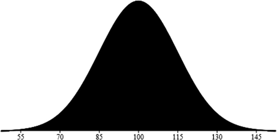
Note that the peak in this graph is the average. So, if a person has an IQ of 145, then only 0.15% will have a higher score.
Now the curve may have different shapes, depending on the variation in the data. For example, if our IQ data has a large number of geniuses, then the distribution will skew to the right.
Leave a Reply